
There is this one problem with javascript fueled widgets, that on interaction they cause other content to jump around the website and it’s rarely good user experience. If possible we should always avoid shifting and I wanted to present you today a neat little trick that may be helpful.
What we will build
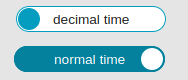
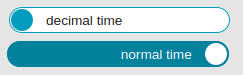
A toggle switch – a widget to change between two possible states.
Assumptions:
- there is always only one of the two labels visible
- visible label is centered
- element’s width is same as wider label’s width to avoid jumping effect when switching
HTML
This an an interactive widget, so I’ll use an interactive element – button – to make it keyboard accessible. Because we will toggle the text inside, we won’t toggle aria-pressed attribute additionally to avoid confusion for assistive technology users.
Inside the button there will be two spans and only one of them will be visible at any point in time. The one, that should stay hidden, will have an attribute aria-hidden="true".
<button type="button" class="switcher">
  <span>decimal time</span>
  <span aria-hidden="true">normal time</span>
</button>
CSS
We will do the trick using display: inline-grid. We want grid layout to make the calculations but our switcher should stay as compact as possible.
.switcher {
    display: iinline-grid;
    grid-template-columns: max-content;
}
Let’s name our grid-area now:
.switcher {
    display: grid;
    grid-template-areas: 'label';
    grid-template-columns: max-content;
}
We want the label area to be as wide as its contents without any wrapping, so we use grid-template-columns: max-content.
Now we position inner elements in the middle by assigning them to a grid-area:
.switcher > * {
    grid-area: label;
}
Both elements are now in the same area overlapping each other and the wider one defines track’s width.
We want to hide one of the two labels but still have it influence parents width, so instead of display: none we’ll go with visibility: hidden. For assistive technology it would be invisible, for sighted users as well, but for layout it would be there – perfect.
.switcher > [aria-hidden] {
    visibility: hidden;
}
And that’s it. Easy and clean.
Fallback
At this point CSS Grid has 94% support (unprefixed) which is a lot, but still not 100%. Some users won’t see the switcher and that’s a truth. My fallback is browser’s default styling (display: inline-block). It means, that inner elements are placed side by side and the switcher’s width is equal to sum of its children widths:
If you want to see this switcher in action have a look here.