
Whenever I open a website and can barely read the text I often think about the WCAG contrast criterion. It sounds pretty simple:
The visual presentation of text and images of text has a contrast ratio of at least 4.5:1, except for the following:
- Large Text-Large-scale text and images of large-scale text have a contrast ratio of at least 3:1;
- Incidental-Text or images of text that are part of an inactive user interface component, that are pure decoration, that are not visible to anyone, or that are part of a picture that contains significant other visual content, have no contrast requirement.
- Logotypes-Text that is part of a logo or brand name has no contrast requirement.
If you don’t know how to calculate the contrast there are many websites, that can help you: WCAG Contrast Checker, contrast ratio, accessible colors. There are also built-in developer tools in many browsers and plugins to make testing easier.
Most (if not all) of those tools accept a few parameters: text color, background color, font-size and font-weight. And in most cases these parameters are enough to determine the contrast. However CSS is a little bit more complex and even if the automated tests are all green the contrast may not be sufficient. Let’s have a look what can be the reason.
Opacity
Whenever we use the opacity property we reduce the contrast between the text and its background. The smaller the value, the more background of the element’s parent will be blended into both background and text color values. For example the image on the right has the opacity of 1 (default) and dark blue text is easily recognizable against the orange background. The image on the right has the opacity of 0.25 and light blue text is barely readable on pale orange background.

Mix-blend-mode
It’s one of the properties I rarely see on production websites, but it can be used to achieve really interesting effects. All the following images have the same background and text colors and only differ by the mix-blend-mode used: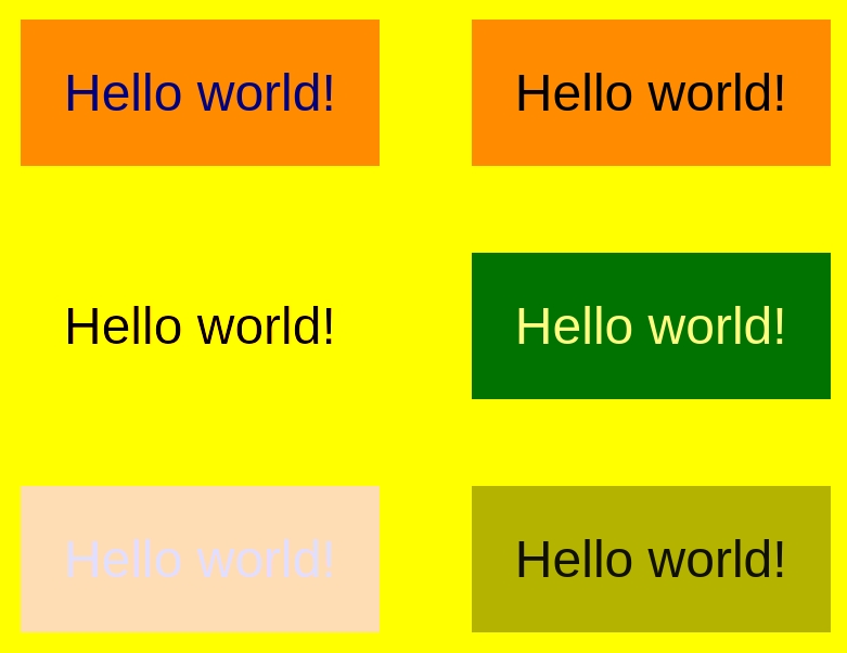
There are no two identical images above. In some cases using mix-blend-mode increased the resulting contrast (for example for the second item, where the text got darker and light background color did not change or third item where text got darker and the background got lighter). In other cases (like fifth image with very pale text on the very pale background) the contrast decreased so much, that the text cannot be read.
Filter
Another property, that can change text and/or background color and is not taken into account while calculating contrast by many tools, is the filter property. And this one is quite often used in production to create the grayscale effect or duo-tone effect, mostly for images, but I have seen enough images with text to know this can be an issue. The image below presents how different output colors may be when different filter values are used. And similarly to mix-blend-mode property, the contrast can be either increased or decreased after applying the filter.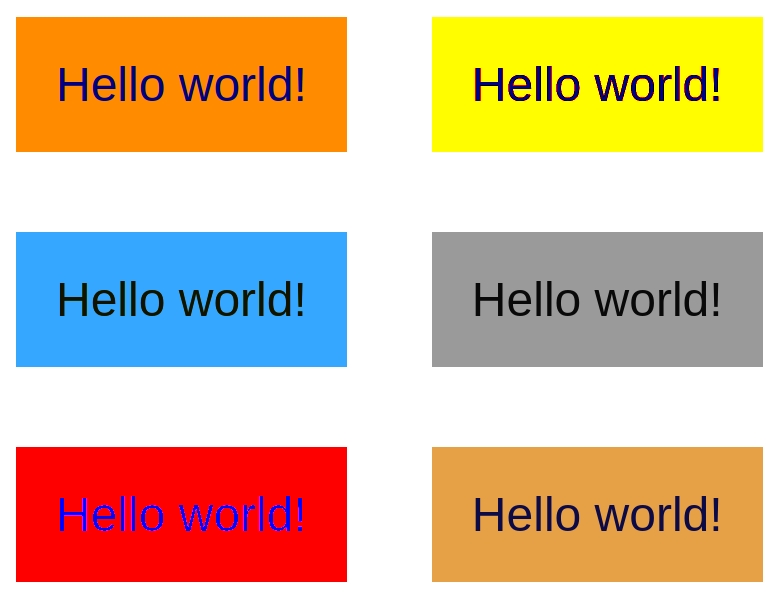
Box-shadow
This may not seem obvious to new developers, but box-shadow does not necessarily go outside the box – it may be drawn inside if the inset value is used (box-shadow: inset 5em 1em gold). If the values are big enough box-shadow may become the actual background color, like in the image below, where it fully covered the color defined with background property and instead of orange we can see the light blue background. What surprised me, the firefox built-in developer tools used the box-shadow color to calculate the contrast so a hat tip from me for the author of the tool.

Transform: scale
Until now we have analyzed the way we can change colors, but the guidelines define different contrast requirements for big and small text, which means, that manipulating font size also has an impact on successfully implementing the criterion. The way we can change the font size without using the font-size property is by involving transform:scale(). I see it quite often when floating labels are put to use. Because transform is one of the best properties to animate and floating labels most often are bigger when they pretend to be placeholders than when they take place next to the input value, combining moving the text and scaling it happens with transform to achieve the smooth transition.

Other properties influencing legibility, but not influencing contrast directly
If you ever watched a movie with subtitles you know the white text with black outline around every letter that is easy to read on any background. Is the world of CSS we can mimic this effect using text-shadow property. This won’t change neither text nor background color, but can definitely improve user experience when text is placed on busy background. This method can also be used to make white text readable on white background, because the outline will make the text clear, however this kind of tricks are always risky.

There is one more property worth mentioning – font-variation-settings. This property indicates a usage of variable font. The values that can be put here can change the look of the letters in very different ways influencing text legibility.
There is also one more challenge, that we may face soon trying to calculate the contrast – color fonts. The technology is not cross-browser friendly yet and except some demos I never saw it in production, but it is definitely exciting and may add quite a lot of complexity to the contrast calculation. I always hope, that one day we get the color font with white inside and black outline to get the movie subtitles convenience without text-shadow trick. This would help sooo many busy images with text put on them to become more user friendly!
Conclusion
Automated tests are awesome and can save us a lot of time, but they are not perfect – we just have proved, that there are more CSS properties, that can influence final contrast, than most calculators take into account. These properties will rarely be put in style sheets by accident and rarely put in production in general, but if we work on some fancy design, it is good to remember that we need to check the contrast manually for those elements.