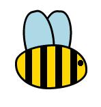
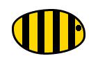
Drawing with CSS is a great way of learning CSS properties, possibilities and limits. And it’s a ton of fun too. Let’s create a very simple drawing today – a silly bee.
HTML
The HTML is very basic and contains only one element with a class, that we will use as a hook:
<div class="bee"></div>
In fact we will style three boxes – the element itself and two pseudoelements – ::before and ::after, but to create these pseudoelements in the first place we’ll need some CSS.
CSS
Bee body
Let’s start with making our bee visible. We’ll give it some basic properties like width, height, and border:
.bee {
  border: 3px solid black;
  height: 60px;
  width: 100px;
}
Next, we’ll create a custom shape using border-radius:
.bee {
  border-radius: 60% 50% / 45% 60%;
}
The exact values are not important at this point, but getting a perfect bee shape can be a great opportunity to learn border-radius. If you prefer graphic interface try out this border radius generator.
Now we miss only two more things – the stripes and the eye. Both will be defined using background property and gradients:
.bee {
  background: radial-gradient(circle at 93% 41%, black 4.5px, transparent 3px), linear-gradient(to right, gold 12px, black 10px);
  background-size: 100% 100%, 22px;
}
The first gradient (eye) will be on top and the second (stripes) at the bottom. We specify the background-size differently for those two gradients, because we need only one eye and multiple stripes.
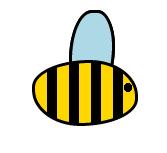
The result is a ready bee body:
Wings
Creating wings will consist of steps very similar to those we took to create the body – first we define dimensions (width and height) with some border:
.bee::before {
  border: 3px solid black;
  content: "";
  height: 80px;
  width: 40px;
}
Then give the wings a custom border-radius
.bee::before {
  border-radius: 60% 45% / 70% 50%;
}
and background:
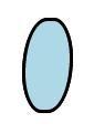
.bee::before {
  background: lightblue;
}
Next we position the wing using position: absolute, left and top. We also apply z-index: -1 to keep the wing behind the bee. To make sure the wings are positioned correctly we add position: relative to the parent:
And at last we rotate the wing a little bit with transform: rotate:
.bee::before {
  transform: rotate(3deg);
}

.bee::after {
  left: 120px;
  transform: rotate(-13deg);
}
And that’s it. The bee is ready.
Complete CSS code looks as follows now:
.bee {
  background: radial-gradient(circle at 93% 41%, black 4.5px, transparent 3px), linear-gradient(to right, gold 12px, black 10px);
  background-size: 100% 100%, 22px;
  border: 3px solid black;
  border-radius: 60% 50% / 45% 60%;
  height: 60px;
  width: 100px;
}

.bee::before,
.bee::after {
  background: lightblue;
  border: 3px solid black;
  border-radius: 60% 45% / 70% 50%;
  content: "";
  height: 80px;
  left: 145px;
  position: absolute;
  top: 50px;
  transform: rotate(3deg);
  width: 40px;
  z-index: -1;
}

.bee::after {
  left: 120px;
  transform: rotate(-13deg);
}