
I like background patterns. They are rather unusual on the web and if I see one in the wild I always smile. If you want to see some examples visit CSS3 Patterns Gallery.
All of those patterns are created using linear and radial gradients. When I first started creating some on my own, I found it rather tedious to type the same color or color stop value multiple times. I could have switched to a preprocessor, but instead I decided to go with custom properties. Let me show you how.
Creating a pattern without custom properties
What we want to achieve is this pattern:
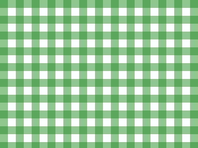
We will split it into two parts: vertical and horizontal and use opacity to make them blend together.
Horizontal stripes

To create this pattern we need two CSS properties: background-image and background-size.
The stripes will be an image rendered with linear-gradient function. Our linear gradient will contain two color-stops: green (rgba(34, 139, 34, 0.5)) and transparent (transparent). We want green part to be 1rem tall and transparent to take the rest of available space. We use 0 as second color stop value to instruct the browser to make a hard stop (switch from green to transparent instantly).
body {
    background-image:
      linear-gradient(
        rgba(34, 139, 34, 0.5) 1rem,
        transparent 0
      );
}
Without a background-size, we get this result:

which is not what we want. We want stripes be as wide as the screen (100%) and repeat every 2rems (1rem green and 1rem transparent). To achieve this we specify background-size:
body {
    background-image:
      linear-gradient(
        rgba(34, 139, 34, 0.5) 1rem,
        transparent 0
      );
    background-size: 100% 2rem;
}
Vertical stripes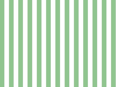
Code to create these stripes is very similar to what we wrote for horizontal stripes:
body {
    background-image:
      linear-gradient(
        to right,
        rgba(34, 139, 34, 0.5) 1rem,
        transparent 0
      );
    background-size: 2rem 100%;
}
We switch gradient direction from horizontal (default) to vertical with to right and swap background-size values because we want this pattern to be full height (100%) and repeat every 2rems horizontally.
Composing multiple linear gradients into a single pattern
To merge horizontal and vertical stripes, we have just created, we use multiple backgrounds syntax:
body {
    background-image:
      linear-gradient(
        rgba(34, 139, 34, 0.5) 1rem,
        transparent 0
      ),
      linear-gradient(
        to right,
        rgba(34, 139, 34, 0.5) 1rem,
        transparent 0
      );
    background-size: 100% 2rem, 2rem 100%;
}
And voila this is our pattern:
Reducing repetition with custom properties
Our pattern is cool, but it’s easy to spot, that some values are repeated multiple times. We can get rid of that repetition with custom properties.
First, we will extract the green color:
body {
    --green: rgba(34, 139, 34, 0.5);
    background-image:
      linear-gradient(
        var(--green) 1rem,
        transparent 0
      ),
      linear-gradient(
        to right,
        var(--green) 1rem,
        transparent 0
      );
    background-size: 100% 2rem, 2rem 100%;
}
Now, every time we change value of --green both gradients will get updated automatically. Awesome.
Let’s do the same with stripe width:
body {
    --green: rgba(34, 139, 34, 0.5);
    --stripe: 1rem;

    background-image:
      linear-gradient(
        var(--green) var(--stripe),
        transparent 0
      ),
      linear-gradient(
        to right,
        var(--green) var(--stripe),
        transparent 0
      );
    background-size:
      100% calc(2 * var(--stripe)),
      calc(2 * var(--stripe)) 100%;
}
Now we can change stripe width in a single place.
This way we created a pattern that can adapt to any color and any stripe width with just two changes. Awesome.
Even more flexibility
But what if we wanted uneven stripes?
We can create new custom property to handle this:
body {
    --green: rgba(34, 139, 34, 0.5);
    --stripe-1: 1rem;
    --stripe-2: 1rem;

    background-image:
      linear-gradient(
        var(--green) var(--stripe-1),
        transparent 0
      ),
      linear-gradient(
        to right,
        var(--green) var(--stripe-1),
        transparent 0
      );
    background-size:
      100% calc(var(--stripe-1) + var(--stripe-2)),
      calc(var(--stripe)-1 + var(--stripe-2)) 100%;
}
Could we extract our green + transparent width into another custom property? Of course!
body {
    --green: rgba(34, 139, 34, 0.5);
    --stripe-1: 1rem;
    --stripe-2: 1rem;
    --pattern-width: calc(var(--stripe-1) + var(--stripe-2));

    background-image:
      linear-gradient(
        var(--green) var(--stripe-1),
        transparent 0
      ),
      linear-gradient(
        to right,
        var(--green) var(--stripe-1),
        transparent 0
      );
    background-size:
      100% var(--pattern-width),
      var(--pattern-width) 100%;
}
At this point width of the second stripe (--stripe-2) is used only once. Should we refactor it back into an inline value? Not really. It’s like naming constants. Even if they are only used once it is much easier to read the name than try to remember what this specific 1rem or 12px meant.
Up to this point all the values we have refactored had a type. We did not declare it anywhere, but it is clear, that --green is a color and --stripe-1 is a width. Trying to put there values like 0.1 or center would cause an error. However CSS does not really care if custom property’s value makes sense on its own. We can refactor our gradient definition even more and it will still work:
body {
    --green: rgba(34, 139, 34, 0.5);
    --stripe-1: 1rem;
    --stripe-2: 1rem;
    --pattern-width: calc(var(--stripe-1) + var(--stripe-2));
    --gradient: var(--green) var(--stripe-1),
                transparent 0;

    background-image:
      linear-gradient(var(--gradient)),
      linear-gradient(to right, var(--gradient));
    background-size:
      100% var(--pattern-width),
      var(--pattern-width) 100%;
}
Or if we feel fancy go even further:
body {
    --color-1: 34, 139, 34;
    --opacity-1: 0.5;
    --color-1-rgba: var(--first-color, rgba(var(--color-1), var(--opacity-1)));
    --stripe-1: 1rem;

    --color-2: 255,255,255;
    --opacity-2: 0;
    --color-2-rgba: var(--second-color, rgba(var(--color-2), var(--opacity-2)));
    --stripe-2: 1rem;

    --pattern-width: calc(var(--stripe-1) + var(--stripe-2));
    --gradient: var(--color-1-rgba) var(--stripe-1),
                var(--color-2-rgba) 0;

    background-image:
      linear-gradient(var(--gradient)),
      linear-gradient(to right, var(--gradient));
    background-size:
      100% var(--pattern-width),
      var(--pattern-width) 100%;
}
Now we can control colors directly with --first-color and --second-color or indirectly with base color in striped rgb format (--color-1: 34, 139, 34;) and opacity (--opacity: 0.5;. If --first-color is defined it will be used, if not, the value composed from --color-1 and --opacity-1 will we used.
Conclusion
Custom properties are awesome and can save us some headache while choosing the right colors for our patterns by reducing number of places we need to edit to get a new result. On the other hand, if named properly, custom properties are like documentation for the patterns making any future edits easier.