
Styling websites sometimes requires more boxes than semantic HTML delivers. To go around this problem we can either put some divs or spans in our markup and style them or use pseudo-elements like ::before and ::after.
Using real elements (spans and divs), that are in the DOM structure, has an advantage of being javascript-friendly. We can query them and manipulate their CSS properties to position them anywhere on the screen and give them any color. On the contrary, pseudo-elements cannot be accessed directly from javascript. The only way of changing their appear with javascript was by using pregenerated classes with all changes we might want to apply on runtime. For example to change pseudo-element’s color when parent element gets class="active" applied:
.parent::before {
    content: "A";
    color: tomato;
}

.parent.active::before {
    color: orange;
}
If there are only 2-3 colors, that our pseudo-elements may need and all are known from the beginning, it’s not really a problem. But if we want to go dynamic this approach bloats CSS extremely fast, because we need to generate classes with all possible color values. Or if we use icon fonts all possible content values. And so on. How can we do better?
Custom properties and inheritance
Luckily we have now custom properties, that are inherited by the pseudo-elements. So if we write our CSS this way:
.parent {
    --color: tomato;
}

.parent.active {
    --color: orange;
}

.parent::before {
    content: "A"
    color: var(--color);
}
We define a custom property --color and use it with color: var(--color). Now we can set --color in javascript like this:
document.querySelector('.parent').style.setProperty('--color', 'orange');
And it can be any color, in any notation accepted by CSS (orange, #fff, rgba(0,0,0,0.5)). The same technique works for any CSS property. That’s cool!
But what about other pseudo-elements?
Styling Browser-specific Shadow DOM
If we have a look at the interns of a range input (Yes! Even if we cannot put anything inside the input tag, it doesn’t mean that there’s nothing there!) and have a look at the developer tools we can see which parts are stylable and which selectors we need to use.
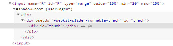
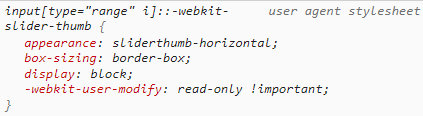
Short note: this selectors are browser-specific, so to create a cross-browser CSS solution we need to write the same code for every browser. It this article I will stick to Google Chrome for brevity.
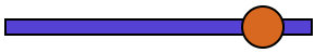
Without any styling a range input looks like this:
And with our styles:
Our CSS looks like this at this point:
:root {
  --custom-1: #D96704;
  --custom-2: #5541D9;
}

input[type=range] {
    -webkit-appearance: none;
    height: 2.5rem;
    width: 50vw;
    margin: 0.75rem 0;
}

input[type=range]::-webkit-slider-runnable-track {
  width: 100%;
  height: 1rem;
  background: var(--custom-2);
  border-radius: 0;
  border: 2px solid #000;
}

input[type=range]::-webkit-slider-thumb {
  border: 2px solid #000000;
  height: 2.5rem;
  width: 2.5rem;
  border-radius: 50%;
  background: var(--custom-1);
  -webkit-appearance: none;
  margin-top: calc(2px - 1rem); /* 2px is border width */
}
Getting it done requires quite a lot of prefixes. Luckily there is CSS generator to help. Custom properties are an awesome way of reducing duplication here – we do not hard code color values, but refer to them using var(--custom-1).
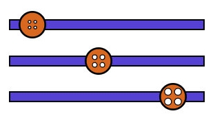
Now, let’s try go to one step further and use javascript to change the look of the thumb of the range input whenever user moves it.
Changing input’s look on input event
Javascript we need is rather straightforward:
document.addEventListener('input', function(event) {
  let value = event.target.value;

  //manipulate value somehow

  document.documentElement.style.setProperty('--custom-1', value);
});
Whenever input event happens, we want handle it – read current value, manipulate it and set on :root (document.documentElement).
This way we can change thumb’s background color using input’s current value. But we are not limited to background colors. What about a background image?
Inline background images in CSS
Using base64 encoded images for backgrounds looks like this:
.with-background {
   background-image: url("data:image/png;base64,iVBORw0KGgoAAAANSUhEUgAAADIAAAA...");
}
But we can put there SVG as well:
.with-svg-background {
   background-image: url("data:image/svg+xml;utf8,<svg xmlns='http://www.w3.org/2000/svg' viewbox='0 0 30 30' width='30' height='30'><path stroke='black' fill='%23D96704' d='M15,0a15,15...'></path></svg>");
}
It may look a little long in the beginning, but after you get used to it, it’s really readable.
First, we declare, that we want browser to treat following code as SVG with data:image/svg+xml;utf8.
Then, we write opening svg tag (<svg xmlns='http://www.w3.org/2000/svg' viewbox='0 0 30 30' width='30' height='30'>). Please note, that all the attributes are in single quotes (') and not double quotes ("), because we use double quotes to wrap all of the SVG. If we started mixing single and double quotes the code would not work – there would be on background image.
Inside svg tag there is a path. There could be anything that is a valid SVG, but we need only a single path to get the effect we want, so let’s keep it simple.
Dynamically generated SVG background
What we gonna do now is extend our CSS a little bit:
:root {
   --svg: url("data:image/svg+xml;utf8,");
}

input[type=range]::-webkit-slider-thumb {
  background-image: var(--svg);
  background-size: contain;
}
We have put the code for the SVG image in a custom property for two reasons: we want to manipulate it with javascript, which would not be possible if we had put it inside the input[type=range]::-webkit-slider-thumb selector. The second reason is that we want to use the same value for all browsers and their prefixed pseudo-elements:
input[type=range]::-webkit-slider-thumb {
  background-image: var(--svg);
  background-size: contain;
}

input[type=range]::-moz-range-thumb     {
  background-image: var(--svg);
  background-size: contain;
}

input[type=range]::-ms-thumb {
  background-image: var(--svg);
  background-size: contain;
}
Now, let’s put some javascript magic into use:
document.addEventListener('input', function(event) {
  let r = +event.target.value + +event.target.getAttribute('min');

  let preview = 'url("data:image/svg+xml;utf8,<svg xmlns=\'http://www.w3.org/2000/svg\' viewbox=\'0 0 30 30\' width=\'30\' height=\'30\'><path stroke=\'black\' fill=\'%23D96704\' d=\'' + calculateD(r) + '\'></path></svg>")';

  document.documentElement.style.setProperty('--svg', preview);
});
We get input’s value and min attribute’s value to use them for further manipulation. Then we setup our base svg code (preview). Finally, we set this new svg-string as --svg property’s value.
In case you are interested in calculateDfunction, that generates the SVG code, here it is:
function calculateD (r) {
  let R = 15;
  let r = round(r * 15 / 100);
  let d = 1.5;
  let Mx = 15;
  let My = 0;

  return "M" + Mx + "," + My +
         "a" + R + "," + R + " 0,0,1 0," + (+2 * R) +
         "a" + R + "," + R + " 0,0,1 0," + (-2 * R) +
         "z" +
         "m" + (-d - +r) + "," + (+R - 2 * r - d) +
         "a" + r + "," + r + " 0,0,0 0," + (+2 * r) +
         "a" + r + "," + r + " 0,0,0 0," + (-2 * r) +
         "z" +
         "m" + (+2 * (+d + +r)) + ",0" +
         "a" + r + "," + r + " 0,0,0 0," + (+2 * r) +
         "a" + r + "," + r + " 0,0,0 0," + (-2 * r) +
         "z" +
         "m0," + (+2 * (+d + +r)) +
         "a" + r + "," + r + " 0,0,0 0," + (+2 * r) +
         "a" + r + "," + r + " 0,0,0 0," + (-2 * r) +
         "z" +
         "m" + (-2 * (+d + +r)) + ",0" +
         "a" + r + "," + r + " 0,0,0 0," + (+2 * r) +
         "a" + r + "," + r + " 0,0,0 0," + (-2 * r) +
         "z";
}

function round(x) {
  return Math.round(x*100)/100;
}
Function round has only one purpose – making numbers short.
As a result we get styled range input changing look depending on its value:
Have a look at a live demo to see it work and let me know if you like it.