
From time to time I go back to the hexagons and try to figure out how to make them responsive. Creating base hexagon layout is a nice challenge for a CSS novice (and a very satisfying one to complete), but as soon as you start resizing your browser window something brakes. Solution? media queries. It’s not like media queries were something bad, but the fewer of them the better.
And now let’s have a look at some hexagons.
HTML
No matter the styling we first need something to style – HTML. This could be divs, but I’ll go with unordered list (ul) and list items (lis). For the demo purpose we don’t need any classes, but a real life use case would profit from naming at least the container.
CSS
We will start wit some basic styles, that will be reused in all following scenarios.
First we reset default list styles and give our hexagons-to-be some background colors:
ul {
    list-style: none;
    padding-left: 0;
}

li {
    background: tomato;
}

li:nth-child(4n + 1) {
    background: yellowgreen;
}

li:nth-child(4n + 2) {
    background: purple;
}

li:nth-child(4n + 3) {
    background: turquoise;
}
Then we put our hexagons into shape:
li {
  --r: 100px;
  --const1: 0.865;
  --hexagon: polygon(25% 0%, 75% 0%, 100% 50%, 75% 100%, 25% 100%, 0% 50%);

  clip-path: var(--hexagon);
  height: calc(2 * var(--r) * var(--const1));
  width: calc(2 * var(--r));
}
I have defined three custom properties: --r,--hexagon and --const1.
--r represents a radius of our hexagon, or more precisely: a radius of a circle containing our hexagon. We will use this value a lot to calculate different values and make the whole design easier to maintain.
--hexagon is in fact only used once, but it’s nice to name this kind of values. Or at least comment, so that you don’t need to ask yourself “what’s that?” looking at your code in a few months. In programming it would be a use case for a constant.
If you need a custom shape have a look at this site.
Last custom property (--const1) is here because we cannot do trigonometry in CSS yet. If you need to know how to calculate it have a look at wikipedia.
Now there is only one hexagon in a line, so let’s rearrange them with some display: flex.
ul {
display: flex;
flex-wrap: wrap;
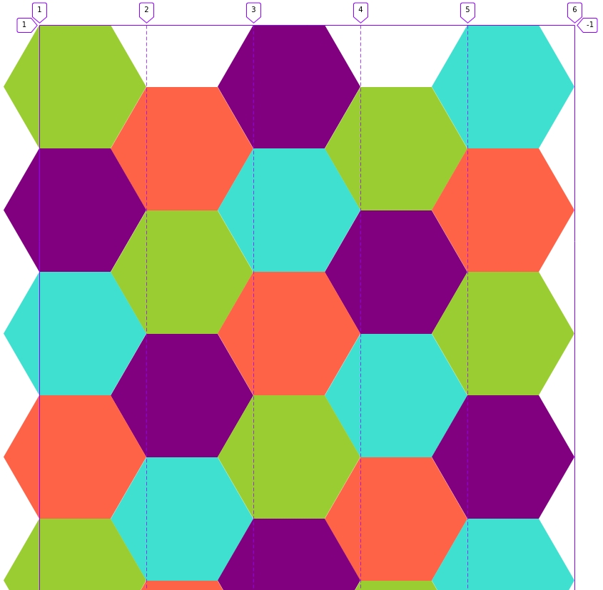
}At this point our hexagons look like this:
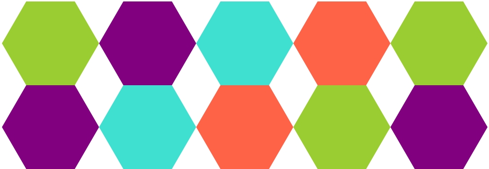
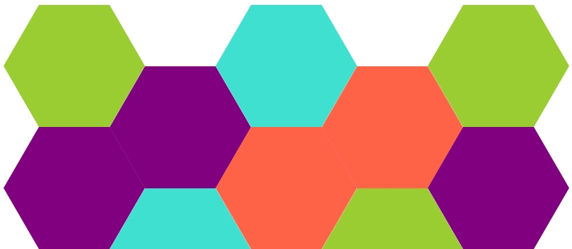
They have the right shape and color, but we want to shift them a little to create a honeycomb pattern.
Flexbox
We will push every hexagon a little to the left, so that they overlap and then push every second a little to the bottom, so that, they do not overlap any more.
li {
  margin-left: calc(-1 * var(--r) * 0.5);
}

li:nth-child(even) {
  margin-top: calc(var(--r) * var(--const1));
}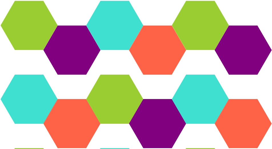
First two rows look fine now, but there is gap between second and third row. Let’s fix that with some more margins:
li {
    margin-bottom: calc(-1 * var(--r) * var(--const1));
}
And now we have it!
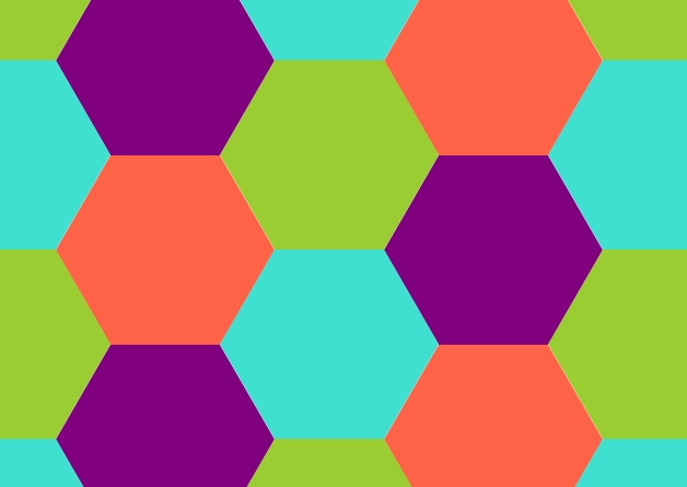
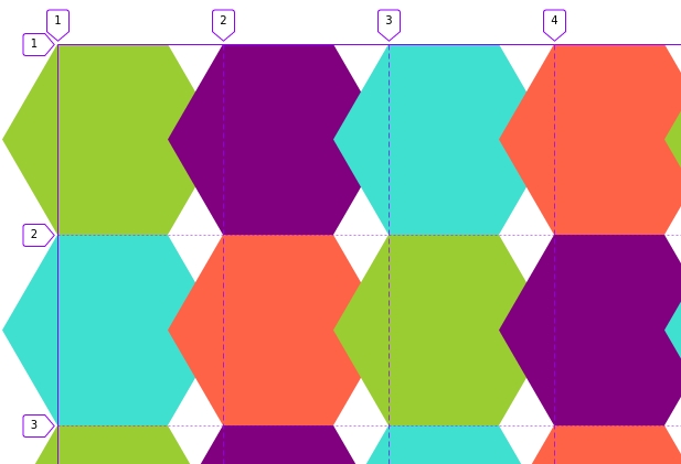
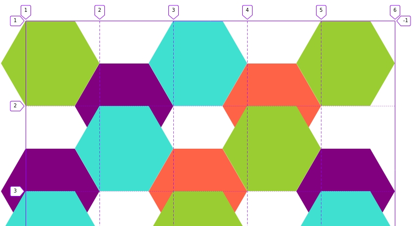
Until we resize the browser window, so that our first row has odd number of hexagons:
Our margins cause now overlapping of our hexagons in a wrong way.
Media queries
The only way of fixing this problem I could come up with was media queries. We need to rethink which items should be pushed to the bottom and which ones not:
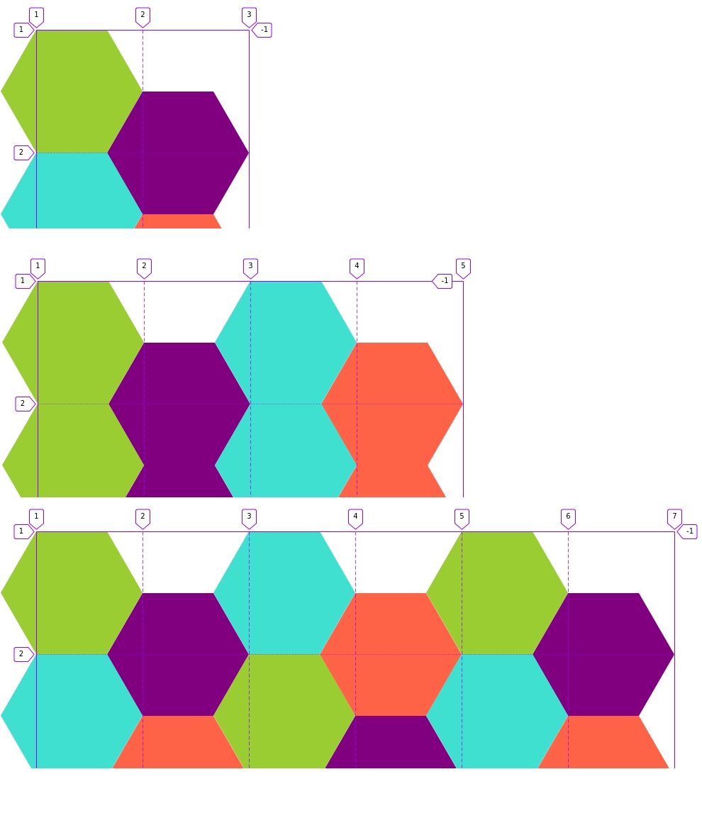
First row:
Green – up, purple – down, blue – up, tomato – down, green – up;
Second row:
Purple – up, blue – down, tomato – up, green – down, purple – up;
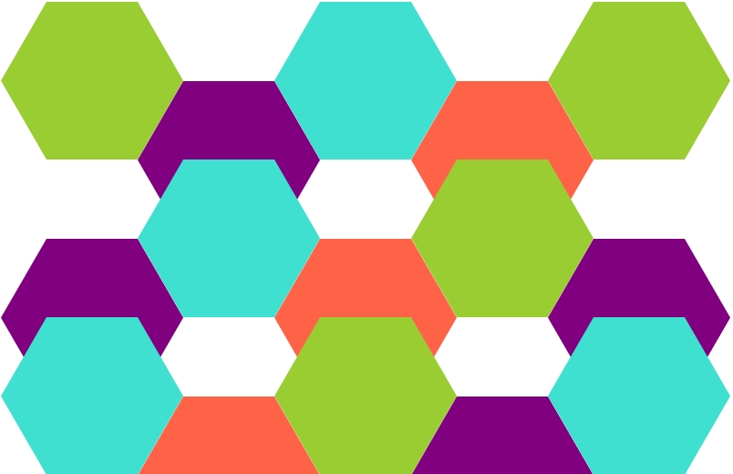
(If you are confused look at the next picture).
We can see that first (0*5 + 1) and sixth (1*5 + 1) elements, second (0*5 + 2) and seventh (1*5 + 2) and all other pairs in first and second row should behave the same way. Our media query should look like this:
@media (max-width: 950px) {
  li:nth-child(5n + 2),
  li:nth-child(5n + 4) {
    margin-top: calc(var(--r) * var(--const3));
  }

  li:nth-child(5n + 1),
  li:nth-child(5n + 3),
  li:nth-child(5n) {
    margin-top: 0;
  }
}
The actual value of max-width depends on all additional margins and paddings around the box with hexagons and should be adjusted according to a use case. This media query should also contain min-width because when only four items can be placed in the first row our standard CSS works well again. Next media query would be needed for 3 items in the top row (or 7, 9, 11 and so on if you want to make your container wider).
If you want to see it for yourself, here’s a working demo.
CSS Grid
Let’s forget all margins we have set for flexbox and start from scratch.
Our container will be a grid container with columns of 1.5 times --r and auto generated rows. The value used for columns will get clear in the next step.
ul {
    display: grid;
    grid-template-columns: repeat(auto-fit, calc(var(--r) * 1.5));
}
Now we shift every element in second and fourth column to the bottom to get the honeycomb pattern again:
li:nth-child(even) {
    margin-top: calc(var(--r) * var(--const1));
}
We have seen this before and solution is the same – margin-bottom:
li {
margin-bottom: calc(-1 * var(--r) * var(--const1));
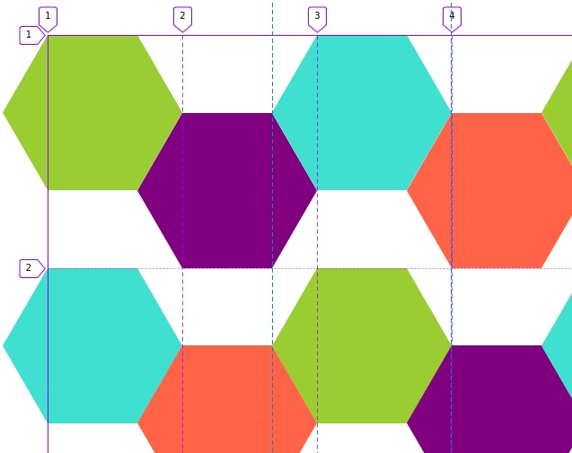
}Our result looks good:
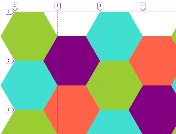
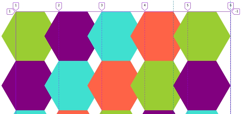
However it has the same problem our flexbox solution has – as soon as we resize browser window things break:
Media query?
@media (max-width: 1500px) {
    li:nth-child(5n + 2),
    li:nth-child(5n + 4) {
        margin-top: calc(var(--r) * var(--const1));
    }

    li:nth-child(5n + 1),
    li:nth-child(5n + 3),
    li:nth-child(5n) {
        margin-top: 0;
    }

}
For more responsiveness add more media queries. A working demo to play around is here.
Restricting number of columns to even numbers
We have already noticed, that whenever we have an even number of columns (2, 4, 6 and so on) our pattern looks good without extra math and extra selectors. What if we could restrict our grid to have only even number of columns?
ul {
    --r: 100px;
    display: grid; grid-template-columns: repeat(auto-fit, calc(var(--r) * 1.5) calc(var(--r) * 1.5));
}
or reformatted for readability:
ul {
    --r: 100px;
    --c: calc(var(--r) * 1.5);
    display: grid;
    grid-template-columns: repeat(auto-fit, var(--c) var(--c));
}
It reads: if there is enough space create (repeat) another group of columns with width: var(–c) var(–c).
Which means our default is 2 columns and if there is enough space – 4 columns (not 3!) and that’s exactly what we wanted!
A working demo here.
Masonry
Firefox allows us now to test their implementation of masonry layout behind a flag (layout.
To use masonry layout we need to modify our container’s CSS:
ul {
    display: grid;
    grid-template-columns: repeat(auto-fit, calc(var(--r) * 1.5));
    grid-template-rows: masonry;
}
It looks almost the same way it looked before, but the lines indicating rows are gone.
Now let’s try make it look like honeycomb:
li:nth-child(2),
li:nth-child(4) {
margin-top: calc(var(--r) * var(--const1));
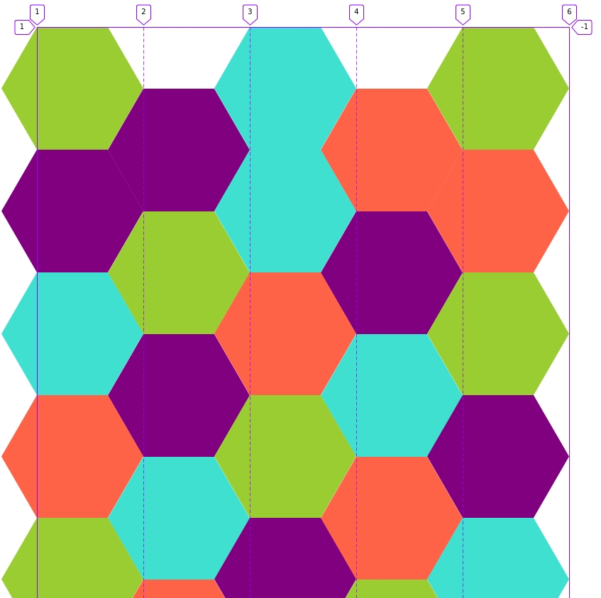
}Notice, that I have selected only second and fourth element. Not every second every fourth but exactly this two. The result looks quite fine, but we notice, that it doesn’t have the right rhythm in the beginning:
If we used different picture for every item no one would notice the problem until they tried to navigate by keyboard.
To fix the issue we need a few more lines of CSS:
li:nth-child(2) {
    grid-column: 3;
}

li:nth-child(3) {
    grid-column: 5;
}

li:nth-child(4),
li:nth-child(5) {
    margin-top: calc(var(--r) * var(--const3));
}
To tell if this layout is responsive we don’t really need to resize browser window – it’s not, because we said directly, that we want our third item in fifth column. If browser window gets too small we get overflow. Solution? Yes, again, media queries.
A working demo to have a look at is here (at this point it works only in firefox and only behind a flag). We could use previous CSS Grid demo as a fallback (using feature queries).