
Since I saw this year’s first snow last week I keep thinking about snowflakes. How they are symmetrical, complex and unique at the same time and most importantly – beautiful. Today I’ll try to recreate some of those properties with SVG and in the second part we’ll make generation interactive with javascript.
Getting started
First we need our SVG tag:
<svg viewBox="-100 -100 200 200" width="200" height="200">
</svg>
Our preview will be 200 pixels wide (width="200") and 200 pixels tall (height="200"). The snowflake will be symmetrical around the point with coordinates (0,0)and consist of 6 identical parts, each 100 units tall. To keep symmetry around (0,0) simple to implement we want to display coordinates between (-100, -100) – these are first and second values in viewBox attribute – and (100,100). This gets us total width and height of 200 units – third and fourth attributes of viewBox.
First stroke
Our starting point will be six identical strokes:
To generate them we’ll need one reusable element, that will be contained in defs block (#arm) and six use elements referencing it:
<svg id="snowflake" viewBox="-100 -100 200 200" width="200" height="200">
    <defs>
        <path id="arm"
              stroke-width="5"
              stroke-linecap="round"
              d="M0,0v100"/>
    </defs>
        <use href="#arm" transform="rotate(0)"   stroke="gold" />
        <use href="#arm" transform="rotate(60)"  stroke="orange" />
        <use href="#arm" transform="rotate(120)" stroke="fuchsia" />
        <use href="#arm" transform="rotate(180)" stroke="purple" />
        <use href="#arm" transform="rotate(240)" stroke="navy" />
        <use href="#arm" transform="rotate(300)" stroke="lightblue" />
</svg>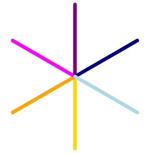
An arm is a simple path 100 units tall with an id, that can be referenced, two more presentational attributes – stroke-width and stroke-linecap. stroke-width defines how thick the line is drawn and stroke-linecap makes line’s ends rounded. We do not define stroke color here in the definition but on use elements to show where each line gets displayed.
Every use element except referencing a definition (href) and giving a color to a line (stroke) has one more thing to do – transform the result by rotating it around the point (0,0) by specified amount of degrees. We do not need to write rotate(0) – it doesn’t do anything – but it makes the pattern rotate values follow more obvious.
This is our base. It’s static. Everything else will be generated dynamically in javascript.
Small adjustment
Every time a user clicks on one of our base lines we want to start drawing new lines from there. Moreover we want to keep our image symmetrical, so that clicking one of base lines initiates drawing in six places. We will achieve it by manipulating arm’s definition. However, to be able to put in arm’s definition new lines conveniently instead of path element we’ll switch to using grouping element g like this:
<defs>
    <g id="arm"
          stroke-width="5"
          stroke-linecap="round">
       <path d="M0,0v100"/>
    </g>
</defs>
Now, whatever we write inside arm element will be rendered on every arm of our snowflake – perfect.
Adding new lines
I am a fan of first trying things out in HTML/developer tools before implementing it with javascript and that’s what we’ll do now. What we want to achieve is a simple snowflake with a few extra lines going left and right from the base lines:
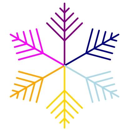
Additional elements we see here (lines to the left and right of base lines) are very similar – we will create a new definition for them and make them respond to two parameters – distance from the center of the snowflake and length, they should have.
Base code we need to achieve this looks very simple:
<g id ="v">
    <path transform="rotate(45)" d="M0,0v1"/>
    <path transform="rotate(-45)" d="M0,0v1"/>
</g>
We will call this helper v, because it contains two lines forming the letter. The lines (path elements) will be 1 unit long for easy scaling. The angle of 45 degrees is arbitrary and we’ll make it dynamic later.
Usage of this new element looks like this:
<defs>
    <g id ="v">
        <path transform="rotate(45)" d="M0,0v1"/>
        <path transform="rotate(-45)" d="M0,0v1"/>
    </g>
    <g id="arm"
          stroke-width="5"
          stroke-linecap="round">
          <path d="M0,0v100"/>
          <use href="#v"/>
    </g>
</defs>
Every arm contains now the path element – our base line and a v element, however be can barely see the v element. It is drawn in the middle of the SVG – both lines of our V-letter start in (0,0) and are only one unit long. To make them longer we’ll use transform="scale()"If we want to make those lines 20 units long – we specify scale(20):
<use href="#v" transform="scale(20)"/>The result however does not look the way we want it:
That’s because we not only scaled the length of those elements, but their stroke-width (thickness) too. There is a simple fix we can use to fix it: vector-effect="non-scaling-stroke".
Now the base lines and newly added lines have the same thickness, but as soon as we start changing SVG’s width base lines’ width will respond to the change. We will block it using vector-effect, which gives us following code as a result:
<defs>
    <g id ="v">
        <path vector-effect="non-scaling-stroke"
              transform="rotate(45)"
              d="M0,0v1"/>
        <path vector-effect="non-scaling-stroke"
              transform="rotate(-45)"
              d="M0,0v1"/>
    </g>
    <g id="arm"
          stroke-width="5"
          stroke-linecap="round">
          <path vector-effect="non-scaling-stroke" d="M0,0v100"/>
          <use href="#v" transform="scale(20)"/>
    </g>
</defs>
Moving new lines away from the center requires another transform. If we have a look at our gold line (<use href="#arm" transform="rotate(0)" stroke="gold" />) we notice that “40 unit away from center” means “40 units to to bottom”. If we want to push something 40 units to the bottom, we want to translate the starting point by 0 units on the x-axis and 40 units on the y-axis. It’s important to put all transforms inside a single
transform attribute. The result looks like this:
<svg id="snowflake" viewBox="-100 -100 200 200" width="200" height="200">
    <defs>
        <g id ="v">
            <path vector-effect="non-scaling-stroke"
                  transform="rotate(45)"
                  d="M0,0v1"/>
            <path vector-effect="non-scaling-stroke"
                  transform="rotate(-45)"
                  d="M0,0v1"/>
        </g>
        <g id="arm"
              stroke-width="5"
              stroke-linecap="round">
              <path vector-effect="non-scaling-stroke" d="M0,0v100"/>
              <use href="#v" transform="translate (0 40) scale(20)"/>
        </g>
    </defs>
    <use href="#arm" transform="rotate(0)" stroke="gold" />
    <use href="#arm" transform="rotate(60)" stroke="orange" />
    <use href="#arm" transform="rotate(120)" stroke="fuchsia" />
    <use href="#arm" transform="rotate(180)" stroke="purple" />
    <use href="#arm" transform="rotate(240)" stroke="navy" />
    <use href="#arm" transform="rotate(300)" stroke="lightblue" />
</svg>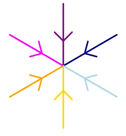
And if we add more v elements:
<svg id="snowflake" viewBox="-100 -100 200 200" width="200" height="200">
    <defs>
        <g id ="v">
            <path vector-effect="non-scaling-stroke"
                  transform="rotate(45)"
                  d="M0,0v1"/>
            <path vector-effect="non-scaling-stroke"
                  transform="rotate(-45)"
                  d="M0,0v1"/>
        </g>
        <g id="arm"
              stroke-width="5"
              stroke-linecap="round">
              <path vector-effect="non-scaling-stroke" d="M0,0v100"/>
              <use href="#v" transform="translate (0 40) scale(40)"/>
              <use href="#v" transform="translate (0 55) scale(30)"/>
              <use href="#v" transform="translate (0 70) scale(20)"/>
              <use href="#v" transform="translate (0 85) scale(10)"/>
        </g>
    </defs>
    <use href="#arm" transform="rotate(0)" stroke="gold" />
    <use href="#arm" transform="rotate(60)" stroke="orange" />
    <use href="#arm" transform="rotate(120)" stroke="fuchsia" />
    <use href="#arm" transform="rotate(180)" stroke="purple" />
    <use href="#arm" transform="rotate(240)" stroke="navy" />
    <use href="#arm" transform="rotate(300)" stroke="lightblue" />
</svg>
And that’s exactly what we wanted!
In the second part we’ll make our snowflakes customizable with javascript.