Once you get to know what art direction is, there is no way back. It’s like learning what kerning is. You cannot unsee it. And the most surprising thing about art direction is, that people can understand it without understanding it – their eyes will follow the path you have designed but will have no idea why they did it. If you want to take a deep dive, I recommend Art Direction for the Web by Andy Clarke.
Some time ago I got chance to try myself with design and art direction (which is not what I usually do; most of the time I just make designed templates happen with HTML, CSS and javascript). It started with the simple “I don’t like this design” after the project manager saw delivered pdf to be translated into a home page layout. “We need to come up with something better” he added and I got a day to propose something.
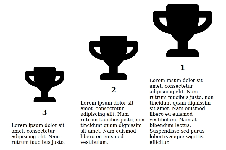
The website was supposed to deliver information about certification levels offered by our client – three levels of badges to display on website, social media and so on. The base for the layout were three images and a few paragraphs of text. My answer (simplified) looked like this:
and I really liked it. Let me explain why.
Size hints importance
The leftmost prize is the easiest to get. To get the middle one you need to put more effort in the task. And to win the first – rightmost – prize you need to be very good. The size of the trophy hints how pride you can be of yourself accomplishing the task – and of course encourages to get the biggest prize. The difference in size is not very obvious but noticeable.
Ascending direction and read order
The text is read from left to right and we can assume the user will start scanning the page from the left. That’s when we want to pick user’s sight up and guide it to the right and top – in the ascending direction to emphasize the ascending, going up, elevating, progressing and achieving more. All of those thing things are positive and we want the visitors to have positive feelings about what they see so we take this approach instead of placing the biggest prize on the left and causing the negative effect of going down when moving to the right.
Target is to be on top
When the user gets to the top and sees the biggest prize we achieved to convey the meaning – now he can look down at other prizes, feel superior and motivated to get that first prize. We all love to win, don’t we?
White space and visual weight
This design is not balanced – it is not meant to be. I wanted it feel more dynamic and clearly communicate the message, that I put more weight on the right column than on the left. The white space on the internet is still somehow rare and in this design it makes it more eye-catching and interesting, because it’s unusual.
Combining multiple factors together
All the elements mentioned before – arrangement, size, in the original design color too – are consistent. It’s important, because the more hints we give, that something is important, the higher the chance, that it will be understood. I don’t really like designs where the whole meaning is conveyed by a single CSS property – only font-weight or only font-size. If may look fine with just a few elements on screen – let say login form with two inputs – but scales poorly when the number of elements increases – like in checkout form for example. This only only one characteristic gets to easy to overlook among other elements and makes scanning much less efficient. And websites, that take a lot of time scan are just annoying.
Will I still like this design in a year or two?
I don’t know. Maybe. I’m pretty sure till then I’ll learn things, that will help me make better design decisions. What I’ve learn so far is that – if you want to get better, you need to practice. Your first tries will not be the finest works of art the world has ever seen, but it is no reason to give up, because trying is always better than not trying at all.