
Creating text decorations with pseudoelements is not new, but it definitely is a nice technique, that is worth knowing. Let’s have a look at a simple example.
The result
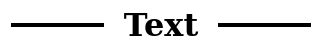
The result we want to achieve looks like this:
It is a centered text with horizontal lines to the left and right. The lines are centered vertically and there is a little space between the text and the lines.
The old way with table and hr
The code I have found in an inherited project looked like this:
<div>
  <table>
    <tbody>
      <tr>
        <td>
          <hr/>
        </td>
        <td>
          <span>Text</span>
        </td>
        <td>
          <hr/>
        </td>
      </tr>
    </tbody>
  </table>
</div>
It had classes sprinkled all over the place, but they are not relevant to understand the problem here, so I have omitted them. The problem is, that this code is semantically incorrect – it was used as a heading, but to screen reader user it would be announced as a table and the assistive technology navigation would not work as expected as the heading element is not used here. But in general it would still be understood and as the technique repeated on every page, the users would get used to it and get over it (probably). The crawlers, however, would probably not, so if you care about search engine optimization (SEO), always keep heading hierarchy in mind.
I won’t discuss the CSS used here, as it is very DOM dependent and even if we replaced all the table elements with divs and spans, we would still create a lot of unnecessary bloat. Let me show you how to do it better.
The new way with pseudoelements and flexbox
Let’s start with HTML:
<h1>Text</h1>That’s it. Concise, I would call it.
Now the CSS:
h1 {
  align-items: center;
  display: flex;
}

h1::before,
h1::after {
  background: black;
  content: "";
  display: block;
  flex: 1;
  height: 3px;
}

h1::before {
  margin-right: 20px;
}

h1::after {
  margin-left: 20px;
}
We start by turning the h1 into a flexbox container (display: flex). The default flex-direction is row – exactly what we need – so we do not specify this here, but it is an important part of the trick. align-items: center will keep the decoration vertically centered.
The pseudoelements will the treated as siblings of the text node inside the h1 tag and to make them occupy the remaining space we set flex:1 on them. This will make them grow equally and fill the horizontal space when there is any left after calculating text node’s width. If the text takes the whole available space, the decoration will not be visible. To create a little white space between text and decoration we use margin-left and margin-right properties.
In the unlikely case of the browser not supporting flexbox, the text will be fully readable and probably aligned to the left, as this is the default, so those users will get an ok experience.
Conclusion
Modern CSS is a great tool to have in a toolbox. It can save quite a lot of typing – less markup, less CSS and sometimes even less javascript if we find a case of layout calculations on frontend. It does not make the old way necessarily bad – in the end, it has done the job, right? But the more we leverage the new CSS, the easier the project gets to maintain and the more robust the solution is – because it is much easier to type h1, than to setup all the structure showed in the first part of this article, isn’t it?