
One of the CSS things, that keep surprising me even though I have done them many times before is how flexbox affects text alignment. It’s like “Why doesn’t my text-align: center work? Is this a flexbox container thing again?”. Let’s have a look.
Text alignment with display: block
If you have a heading (h1, h2, etc.) or a paragraph (p) or any other element, that has the default display value of block, it takes all the available width. We can see it clearly if we apply any background color to the element:
The background is wider than the text inside the tag and the text is aligned to the left. The whole light blue space is where this text is supposed to placed -it is the box containing this text. If we use text-align: right, the browser will see that the box is wider than the text and render the text on the right and leave empty space on the left, like this:
Text alignment with display: flex
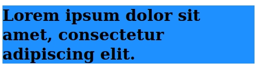
If we change the display to flex and do not define text-align, the result looks just like if we had used display:block:
But in fact something has changed: the flexbox context means, that there was an anonymous box created for the text and this anonymous box is just as wide as the text it contains and this box got placed using flexbox algorithm where the flex-start is – on the left. The white space on the right is not part of this anonymous box created for text. Because this box is anonymous we cannot target it with any CSS selector and change its background color, but we notice, that something is weird, when we try to use text-align: right and (on a wide screen) nothing happens:
HTML:
<h1>Lorem ipsum dolor sit amet, consectetur adipiscing elit.</h1>CSS:
h1 {
  background: lightblue;
  display: flex;
  text-align: right;
}
Result:
If we wrap the text in a span we can visualize the problem:
HTML:
<h1><span>Lorem ipsum dolor sit amet, consectetur adipiscing elit.</span></h1>CSS:
h1 {
  background: lightblue;
  display: flex;
  text-align: right;
}

h1 > span {
  background: dodgerblue;
}
Result:
The box generated for span and the anonymous box generated before are exactly the same when it comes to text alignment.
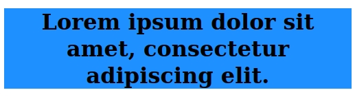
If we want to push the text to the center we need to use flexbox specific property: justify-content: center.
However it does not actually center the text. What gets centered is the box containing the text and if we make the viewport narrower we see it clearly:
Now we have no white space on the left and right and the box with text takes the whole screen width. If we apply text-align: center, we will see it work just like it would with display:block:
Conclusion
Flexbox is a great tool for layout, but it needs a little bit more attention when it comes to text alignment. The property text-align works as expected only on smaller screens when the box containing the text takes flexbox container’s full width. Whenever the text takes less space (like on wider screens) – we need to use justify-content to place the text inside the flexbox container on the right or in the middle. If the text is wrapped in additional element – like span – we can force that element to take flexbox parent’s full width with flex: 1, flex-grow: 1 or width:100%, which will also solve the problem, however if I didn’t have this additional inner element I would not insert it just to align text.